Mockups


Above is my final output for the social media sticker set featuring the updates to that I had made after doing some user testing. I’m really proud of my work and I believe it’s a great summation of everything that I’ve learnt from my course being brought together in to one final piece.
After receiving some user testing, there were some changes that I wanted to make some changes to the designs based on the feedback that I received during my user testing. My thoughts and reaction to the feedback I received can be seen here. One of the first changed that I wanted to make based on my user testing was changing the sticker of Death laughing.
I’d been indecisive about this sticker as although it met a purpose, it was against the character of Death and some of my feedback points this out. I changed the design to a previous version with Death playing the guitar. The depiction of Death with a guitar comes from a later book in the Discworld series, but since this is a movie adaptation there is a lot of wiggle room in the designs.
I also took this opportunity to tweak the rest of the design, such as adding a robe to the design of Death and smudging the colours of the fire.
Some of my feedback mentions the Octavo (the chained up book) and how it doesn’t seem to have any function in communication. I originally added it as a nod to the story of The Colour of Magic (1983) but the feedback raises a good point. I want my sticker set to be used in communication and as it currently stands the Octavo is ‘dead weight’.
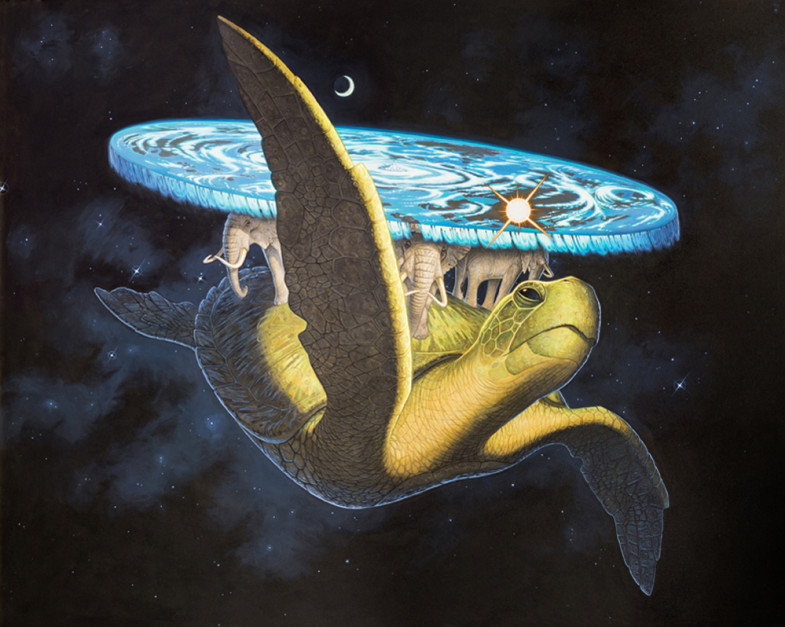
I still wanted a sticker that represents the series somewhat, but might have some usage in communication. I decided to produce a sticker of The Great A’tuin as it’s quite iconic of the Discworld series.
I want to change the sticker “Octavo” to one of the Great A’Tuin, but before I begin I wanted to do some research into the design of the Great A’Tuin before I sit down and make the sticker. I need it to match the style of the other stickers as well as being recognisable to the Discworld series.
It’s important that my depiction of the Great A’tuin reflects the picture that Sir Terry Pratchett gave in his Discworld series, mainly to keep consistency with the rest of the stickers, but also to ensure that the sticker is recognisable and doesn’t confuse any Discworld fans. Below is Sir Terry Pratchett’s written description of the giant turtle.
“In a distant and second-hand set of dimensions, in an astral plane that was never meant to fly, the curling star-mists waver and part…
See…
Great A’Tuin the turtle comes, swimming slowly through the interstellar gulf, hydrogen frost on his ponderous limbs, his huge and ancient shell pocked with meteor craters. Through sea-sized eyes that are crusted with rheum and asteroid dust He stares fixedly at the Destination.
In a brain bigger than a city, with geological slowness, He thinks only of the Weight.
Most of the weight is of course accounted for by Berilia, Tubul, Great T’Phon and Jerakeen, the four giant elephants upon whose broad and startanned shoulders the disc of the World rests, garlanded by the long waterfall at its vast circumference and domed by the baby-blue vault of Heaven.” Terry Pratchett, P3. The Colour of Magic (1983).
The description of the Great A’tuin is in reference to a hindu mythology about the origin of the world. A turtle with four elephants on it’s back and a large disc that is the world we know. Pratchett’s depiction of this is interesting, using descriptors such as “startanned” and “hydrogen frost” really help paint the rather absurd image in your mind.
Once again, I turn to the works of Paul Kidby for his depiction of The Great A’Tuin. I’m hesitant to reuse the same source, however Kidby has been the official illustrator for the Discworld series for over twenty years and his style is a great adaptation of Pratchett’s world and characters. Below are some of his paintings of The Great A’Tuin.
“Great A’Tuin II” Paul Kidby (2013)

“Great A’Tuin Rising” Paul Kidby (1999)
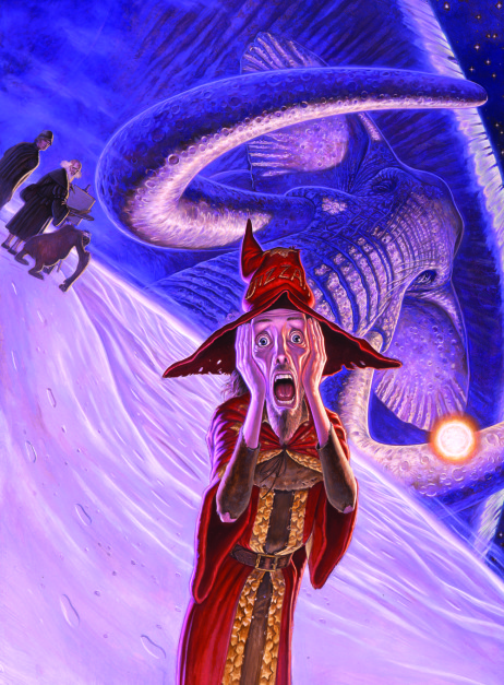
“The Rincewind Scream” Paul Kidby (2002)
The works above depict the Great A’Tuin from different perspectives that helps to visual the scale of the gigantic turtle. He shows the waterfall off the edge of the Disc, the large mountain at the hub of the disc, Cori Celesti as well as showing weather effects such as clouds, as well as the sun and the moon. Looking at Kidby’s work helped me picture Pratchett’s description.
After looking at Paul Kidby’s representation of the Great A’Tuin I wanted to see how it was depicted in the TV Movie directed by Vadim Jean. I’ve mentioned before that this is a good example of what the fictional theatrical release might look like, so seeing how the Great A’Tuin is depicted in a live action movie will be helpful when designing the sticker.

From the front.

From the side.

From Above.
In summary, what my sticker of the Great A’Tuin should include is the following:
Pratchett, T., 1983. The Colour of Magic. 1st ed. Great Britain: Colin Smythe.
Kidby, P. (2013). Great A’Tuin II. [Acrylic on Canvas] Private Commission.
Kidby, P. (1999). Great A’Tuin Rising. [Pencil on Paper] Preliminary Drawing.
Kidby, P. (2002). The Rincewind Scream. [Oil on board] The Last Hero.
Terry Pratchett’s The Colour of Magic. (2008). [film] Directed by V. Jean. United Kingdom: Sky 1.
After finishing my first rendered draft of the sticker set, I wanted to get some feedback from general users to test if my stickers are effective enough. Ultimately, they need to be good enough for the users to want to download the sticker pack as well as do a good job in representing the characters.
I sent the sticker pack to several of my peers, including a few who read Sir Terry Pratchett’s Discworld to get some opinions of Discworld fans, as well as others who had no idea as to what the stickers were based on. I’ve listed the feedback below.


From what I can tell from my feedback, is that the sticker set works well in some areas and not so well in others. I was worried about the representation of Death and it’s interesting see this being reflected in my feedback. There are some stickers that were added to display story elements from the film, but as my feedback suggests that they’re practically useless in communication.
From what I can gather from my feedback I need to make a few tweaks an changes to the designs and potentially change some of the stickers.

Above is the first rendered draft of the stickers that I produced using Procreate. I’m really happy with the quality of the stickers and how they’ve turned out. I was able to use some of the brushes in Procreate to apply a great amount of texture to the stickers. At this stage I was in half a mind to import the final designs into a program such as Adobe InDesign to do the text present, but I felt that having a font would subtract from the hand made feel that I wanted in my stickers.
At this stage I’m really happy with how the stickers have turned out but that might be because I’ve spent the past week or so staring at them, so in order to ensure that the stickers are the best that they can be, I think user testing is needed to get some feedback on the stickers, just incase I’ve looked over anything important.

I spent some time thinking about the sticker designs, making mental notes about what I liked about each sticker and what I didn’t like. In the first draft, many of the proportions and lines were rough and not to standard, so I took some time being more precise with my hand renditions of the stickers in this second draft, so when the time comes to render the stickers digitally, applying a fine-liner over the sketches in order for the scanner to display them more accurately, this was primarily done to save time in the next step of the production.
Various changes have occurred in this rendition of the sticker set. An example would be that all of the stickers are now “self contained” using lines to act as a natural end point of the art work. Due to the nature of how the stickers would be used, relying on borders for the design to work is not feasible in this case. An example of this can be found in the “Rincewind Screaming” sticker. In the first draft, his hat extended off screen, it’s not been updated to be self contained.
One major design change was the removal of Death’s Guitar sticker. I felt that as it wasn’t shown in The Colour of Magic. It shouldn’t be included here. But as Terry Pratchett’s The Colour of Magic (TV Movie) showed elements from Pratchett’s wider works might be included within the fictional adaptation. For now, I’m happy with the depiction of Death, though part of me feels that this goes against his character.
Before I begin to render my sticker designs digitally, I wanted to explore different styles/techniques that I could potentially use when rendering my final stickers. I experimented with a variety of styles and techniques, trying different software and hardware in the process. A breakdown of each style I explored can be found below.

In this style, I used the pen tool in Adobe Illustrator to ‘ink’ the lines using just a mouse tool. The colours used were basic flat colours and the style didn’t show any ‘texture’ very reminiscent of most digital art pieces today. I find the presentation of this style to be too ‘clean’ and ‘uniform’ and as a result, feels like there’s no personality within this style, which is the opposite of what I want my final stickers to convey.
I experimented with shading on the hat, to get a sense of what it could look like shaded. It was also at around this point that I realised that my line work in my initial sketches was a bit choppy and needs to be updated. In summary, I feel this style is too generic and feels like something that a computer would churn out instead of having a handmade feel to them.

For this style, I hired out a Graphics tablet from the Digital Arts Centre and traced over the original sketches in Adobe Illustrator. This time opting to use thicker lines that don’t all join up. I used the same basic colour palette as in ‘Style #1‘.
I found that a lot of my dislikes for the first style had also translated into Style #2, though admittedly the thicker lines added a bit more character to the sticker. With a few tweaks to the sticker such as experimenting with the colours used, adding shading and adjusting the initial sketch, I think this style could potentially be used for the final sticker set, though I want to experiment some more with other methods of rendering.

One element that I felt was giving the previous two styles their ‘clean’ look was a lack of textures and use of lines. I thought back to my experiences in Concept Visualisation in first year and remembered a ‘digital paper cut‘ style I had developed in that module. The above rendition was produced in Adobe Photoshop mainly using the pen tool. Style #3 is a combination of the ‘digital paper cuts’ style and adding some texture using the multiply tool in Adobe Photoshop.
I’m not happy with how style #3 came out, it could be down to a multitude of factors such as the colours used, a lack of shading/shadows to differentiate the layers or the intensity of the texture applied. One of the key roles for the stickers to do is to communicate through facial expressions, and this style makes rendering faces quite troublesome, down to the lack of lines elsewhere in the style.
This was an experiment that I’m glad I took the time to explore, because even though I’m not happy with the results and won’t be using this style in my final stickers, it’s proof that exploring different methods before hand is worthwhile. If I had chosen this style from the get go, I would have spent hours trying to get it to work.
It’s worth to point out, at this stage I have gone back to update my sketches of the stickers, more information can be found here.

With the updated hand renders of the stickers, I decided to experiment with the options that Adobe Illustrator offers. After taking some time to reflect on what I didn’t like about Style #1 and Style #2, I realised that a lot was in the smooth lines that didn’t have texture or character. I traced over the hand renders using a brush designed to mimic a pencil. The simple change of a brush had a major impact on the tone and feel of the sticker.
I’m really happy with this style and it’s definitely one I’m considering when rendering my final stickers, it’s a lot more detailed, than other styles and has the hand drawn quality that I’m seeking.

When I was importing the reference image into Adobe Illustrator it gave me the option to ‘image trace’ the reference layer. I was amazed by the level of control you have over this feature that I have often overlooked and I’m impressed by the results of this. Some stickers were better off than others but with a few tweaks I can see this being a style that I could pursue.

I had the opportunity to try out the Apple Pencil and Procreate 5 and produced the above image. There was lots of brushes to choose from that all brought different textures to the table, I’m really happy with the style above due to the level of control that this style brings, such as the pressure sensitivity that the Apple Pencil provides and the multitude of brushes provided by Procreate. The textures and subtle shading were influenced by Cam Kendell’s illustrations,
The style brings to the table the ‘hand crafted’ feel that I wanted my stickers to convey, it has subtle textures in the lines and even the colouring that makes the style stand out whilst also conveying the message I want it to. The lines are thin enough that they’re not obtrusive, yet big enough to still display the individual blemishes and breaks in the line that mimics that of actual ink on paper.
After thinking about what I’ve learnt when producing these examples, I ruled out the first three styles, due to them coming across as too ‘digital’ and that’s not the theme I want to go down for my Major project. Style #5 was then also ruled out at this stage, using the image trace feature in Adobe Illustrator leaves a lot to be desired and you lose a lot of control over your work using that method,
This left two styles, Style #4 and Style #6 this question mainly came down to deciding how I was going to physically render the designs. I’m happy with both of them and could see them be used. I ultimately decided to go for Style #6 down to the wide range of brushes available in Procreate and the prospect of learning a new industry standard software.

I’ve applied the art style I chose to the rough sketches I made. I decided to see what it would look like if Death was playing the guitar instead of laughing. At this stage I’m unsure which of the two I should use. Death playing the guitar does a good job at showing his character, but at the same time it doesn’t appear in The Colour of Magic (1983) .
Applying the art style has helped to further visualise the stickers. Some areas do need to be worked on as at the moment I feel that things might be too cluttered, such as the visual representation of golden coins in Rincewind’s sticker. At this stage, I want to work on Rincewind’s hair and I’m not happy with the posture of Twoflower in the sticker of him with Rincewind.
With a few tweaks, I’m happy overall with the character designs.
