The Colour of Magic is a comic fantasy novel written by Sir Terry Pratchett and was first published by Colin Smythe in 1983. This book proved to be the first in Sir Terry Pratchett’s long running comic fantasy series (consisting of 41 novels) known as the Discworld Series. The genre is a gag take on some traditional fantasy cliché’s and often takes common tropes, puts them on its head and spins it around rapidly.
In my final project, I’m assuming the client is producing a fictional movie release of The Colour of Magic and has asked me to produce a set of social media stickers in order to promote the film. I decided to re-read the book to get a feel for the characters, thinking of different scenes I could potentially represent in the stickers and more importantly what characters to include in the sticker set.
The story revolves around three main characters and a lot of antics. The three characters include Rincewind (A wizard who can’t cast spells), Twoflower (The definition of tourist) and The Luggage (A chest with hundreds of legs and likes to eat people). The book covers a lot of ground of setting up the world, and also introducing and setting up lots of important characters that are featured prominently throughout the book series but make relatively small appearances in this book. Example of this would be the introduction of characters such as Death, The Patrician, and The Librarian (who isn’t even an orangu-tan yet!)
After re-reading the novel, various scenes spring to mine that I could potentially represent in my sticker set, such as Rincewind’s reaction to Twoflower’s camera and Rincewind running away (He does this a lot). I have a clear idea of what I want to include into my stickers.
Pratchett, T., 1983. The Colour of Magic. 1st ed. Great Britain: Colin Smythe.
For this major project, I wanted to look into the effects that design has on communication. One such area that graphic design has impacted communication would be the implementation and use of ’emojis’. Since their inception, they were intended to be used as ideographs to represent ideas/concepts such as emotions, but the cultural impact Emojis have had has been much wider than you would think, and as a result questions of representation within emojis has been raised.
In 2016 the company Always launched a new part of their #LikeAGirl Campaign that tackled the issue of representation in emojis. The campaign argued that most of the Emojis that were commonplace feature lots of male representation, with little to no female representation. The reason for why this was an important issue that needs to be changed is down to the affects that they have on self esteem.
Always sponsored a national survey on the topic, reaching around 1000 women, Fitfy-four percent of the recipients aged between 16 to 24 years, think that female emojis are stereotypical, with just about half saying that emojis represent a limited range of female interests.
This is an area that I would have overlooked without paying too much attention to it. Granted, this a hot button issue with two sides to the story. It’s important to be aware of affects that graphic design can have so you can accommodate for it.
Pepe the Frog is a comic book character that was originally created by American comic book artist Matt Furie. Pepe the Frog was created for an online comic book called ‘Boy’s Club’ in 2005. Over the years since the debut of Pepe, his image spread across the internet and became a popular meme.
The reason that I’m looking into Pepe the Frog is because this is a case where users the original intended meaning behind the character had been changed by users. The Memes were tame at first but they eventually became morbid and racist in nature, with many on the political fringes using Pepe to propagate their agenda. This then escalated to a point where the ‘Anti Defamation League’ added the character to their database of hate symbols in 2016. It’s interesting how the meaning behind an image can change and is something to be understood. In the case of Pepe the circumstances for this happening are completely random, it took about ten years for the meaning to change drastically.
Being mindful of the fact that the meaning of an image can change when designing the stickers is important to the success of the stickers, an example of how the meaning behind a social media sticker changed would beSyd Weiler’s Trash Doves.
Furie, M. (2016). Boys Club. 1st ed. Fantagraphics Books.
This sticker pack was designed to promote the children’s television series Power Rangers released by Saban Brands. The sticker pack contains twenty non animated stickers featuring different characters, good guys and bad guys within the sticker pack. The pack contains eight stickers featuring text where as the rest rely on body language and some basic codes to convey meaning. I.e. a thought bubble with rain in it to convey being upset/down in the dumps. The stickers are all of a consistent style and seem to play it safe, using basic body language in most of their designs to convey meaning.
Rick and Morty
This sticker pack is based off the TV Rick and Morty and features 16 non animated stickers based on several of the characters from the TV show. Unlike the Power Rangers sticker pack I looked at before hand, the style used for this pack is the same as the style used within the TV show. The majority of the sticker pack uses text alongside an illustration to convey meaning where as the ones that don’t rely on facial expressions to convey meaning.
Saban Brands, (2014), Power Rangers Stickers [ONLINE]. Available at: https://facebookstickers.info/power-rangers/ [Accessed 28 November 2017].
Adult Swim, (2017), Rick and Morty Stickers [ONLINE]. Available at: https://facebookstickers.info/rick-and-morty/ [Accessed 28 November 2017].
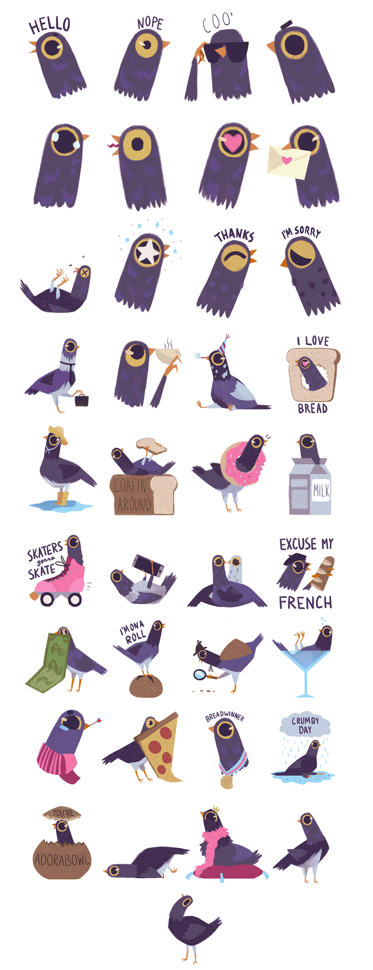
Syd Weiler is an American Animator and Illustrator based in West Virginia, in 2016 she created the Trash Doves Sticker Pack for iOS that was later licensed by Facebook. The sticker set features 37 animated and non animated stickers based around a purple dove doing various activities and showing a variety of emotions.
“Trash Doves Sticker Pack” Syd Weiler (2016)
When the sticker set was added to Facebook in late 2016, the sticker set had an unintended side affect, with a certain sticker of the dove “head banging” became spammed as a result of an internet joke. Most comment sections were spammed with the sticker and from my own experience it was spammed in group chats, getting in the way of conversation.
Seeing the affect a sticker pack has had on the social media site made me question if there has been any other effects on conversations due to stickers. Though, spamming the website for a week before the joke became old was only a part of the bizarre case of this sticker pack.
Due to the release date of the sticker set, it was coming up to the 2016 Presidential elections in the United States of America, and it seemed that everything was becoming politicise including the trash doves sticker set. The sticker set was accused of being used as a symbol for the ‘Alt-Right’
The trash doves sticker set is a good example of how Graphic Design has an affect on communication, and communication can have an affect on the Design. This is an example of where the sticker set impeded and even stopped communication and where the meaning of the Designs had changed through word of mouth. Understanding the impact this has can lead to answering the question of my study.
Sushi Friends
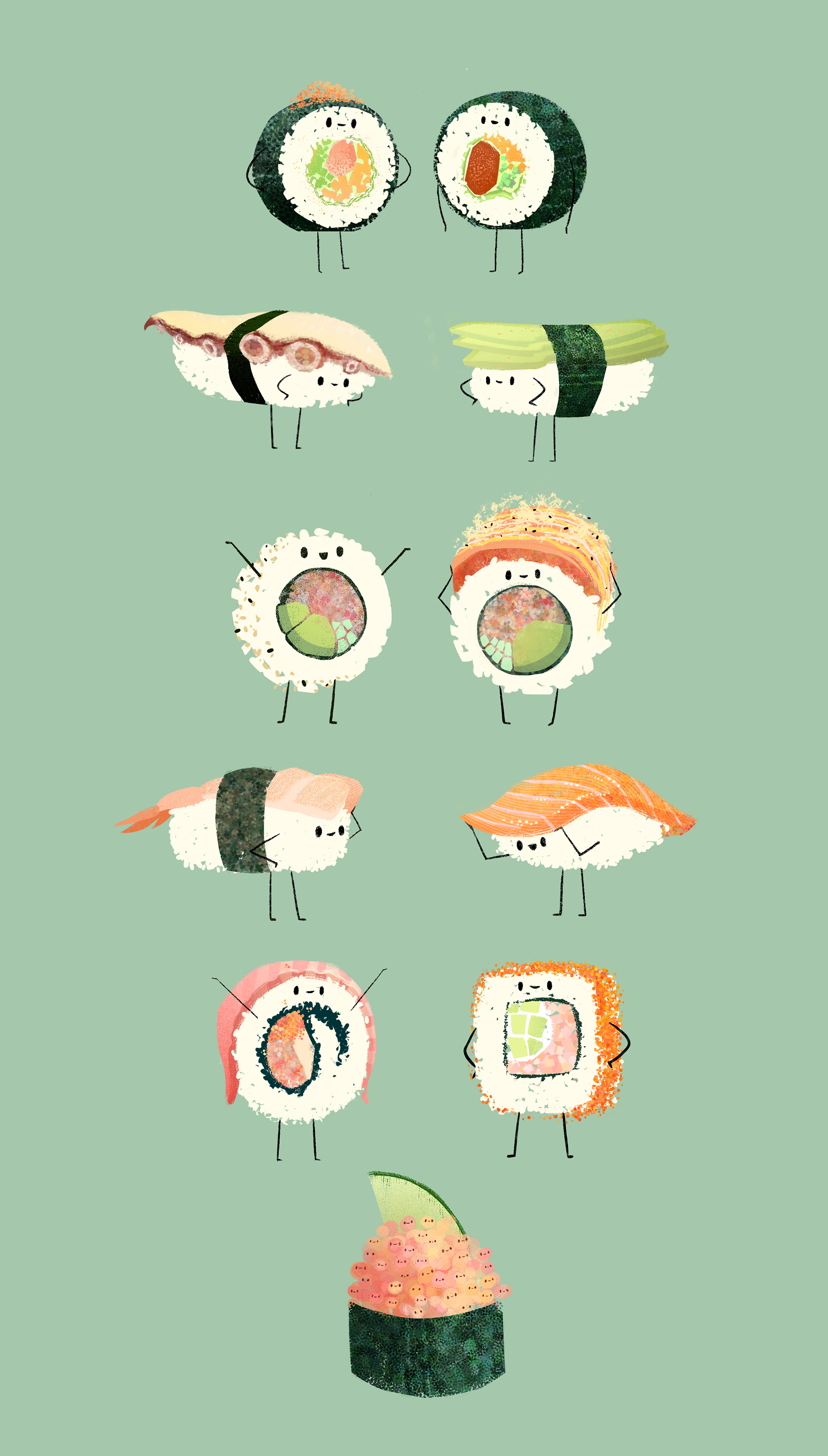
Wanting to find out more about the sticker set, I found Syd’s portfolio and discovered other examples of her work. Such as the illustrations referenced below. I really liked the use of texture in her digital illustrations. It adds a new dimension to how an image is represented digitally.
In an age where digital art is becoming more and more common, I’m finding crisp and clean visual representations are becoming over used. Something that was lost when doing digital art work, such as texture being re added with special brushes and adding settings I’ve found works really well and is something to consider for my own sticker pack.
Quan Inc. Is a Japanese web development company that specialises in creating characters, designing stickers for messaging services such as Facebook Messenger and Kik messenger. Quan Inc has been making stickers for the past couple of years and have a list of eleven different sticker packs to choose from within the Facebook sticker store. Below are some samples of the different sticker packs.
Masked Wrestler Q
Meow Town
Ninja Bear
Nyanchi
Piyomaru
Sugar Cubs
Yarukizero
Yuttari Dragon
Bettakuma
Business Fish
Fantastic Sumo
The stickers range over a host of different artistic styles, some being cute and others being quite obscure with their art styles. I’m going to look into two of their sticker packs to analyse design choices and to get ideas for my own stickers.
Yuttari Dragon
Above is the complete selection of the stickers provided in Quan Inc’s Yuttari Dragon sticker pack. All of the stimages above are static images and non animated. Four of the stickers display text of some variety such as as the signs saying ‘yes’ and ‘no’. The rest of the stickers seem to show different emotions and feelings such as crying, sleeping, love, happiness, excitement..etc. The stickers are cute in appearance due to the simplistic shapes such as basic circles and curves.
The colours used also contribute to the appearance of the stickers since most of the stickers are coloured with pastel colours. Since Quan Inc is a Japanese company there are may codes and signifiers here that do not work with a western audience, such as the hash tag symbol on the side of the dragons face in the sticker to the left of this paragraph indicates ‘anger’ yet this would not work with a western audience as that is a Japanese code.
There are some more obvious examples of this featured in this sticker pack such as use of the Japanese language within the stickers, language is something that I should consider if I decide to use text within my stickers, should I make multiple packs for different languages? Or should I take a similar approach to Quan Inc and just use the one language.
The stickers make use of simple pastel colours and most of them are very colourful making them attractive to look at and subsequently be used in a text conversation. The illustrations use thick outlines and all have a general ‘hand drawn’ aesthetic to them. All of these contribute to give a cute appearance and work quite well for the medium that they’re designed for.
Business Fish
Where as Yuttari Dragon‘s main appeal is it’s cute simplistic style, Business Fish‘s appeal is completely different. Business Fish is quite absurd in it’s premise and execution. The sticker pack was designed around a character whose a business man with a fish head. The sticker pack features six stickers that use text where as the rest of them play with facial expressions and body language in order to convey meaning.
Since the style is slightly absurd and isn’t going for the cute aesthetic that the other sticker pack went for, Business Fish mainly uses muted realistic colours and thin outlines in its execution.
Unlike the Yuttari Dragon sticker pack, this pack seems to be more friendly with it’s codes and signifiers with only a few showing the cultural origination of the stickers. For example the two depicted below this paragraph show cultural norms that can be found in Japan, such as wearing a face mask to depict being sick and bowing. In Japan bowing is a lot more frequent than in the United Kingdom so knowing the context of where these stickers originated from it makes sense as to why it’s included within this sticker pack.
Looking into the relationship between communication and design is a crucial focus for my study, so looking into already existing examples is important for getting an idea of how the two concepts are inter linked. Designs can be used in lots of different contexts in order to communicate, from subliminal designs advertising a product to more impactful designs delivering instructions.
A good example of designs that communicate instructions are traffic signs. They need to be simple enough to understand yet impactful enough to be understood and followed. They need to be recognisable from a distance and distinct enough to not be confused with another sign, all of these factors have restricted the types of designs and the colours that can be used in the designs of traffic signs.
As a result, most of traffic signs used by The Highway Code make use of simple colours, numbers and basic shapes to convey meaning. For example signs that utilise red circles are usually prohibitive with their message and triangular signs are warning signs. By using simplistic icons depicting different types of transport and road i.e. bicylces and bridges, a minimal use of colours that have semiotic meanings i.e. red equals danger/stop red equals good/go, they have been quite effective with their designs.
This slideshow requires JavaScript.
Driver and Vehicle Standards Agency (DVSA), Great Britain: Department for Transport, 2015. The Highway Code. London, United Kingdom: TSO.
Thing Explainer: Complicated Stuff in Simple Words
Thing Explainer is a book written by Randall Munroe. The premise of the book is to explain complicated objects or processes using simple terms and as a result theres a lot of illustration and infographics contained within the book making it quite humorous but also a valuable resource to look at to see how the design is communicating information to the user.
I don’t know anything about submarines, but the following infographic of one taken from the book is a good example to see how the information is communicated.
It uses really simplistic language such as “breathing stick” and “sound lookers” to explain what the different parts of the submarine do. It simplifies infographics and it’s valuable to look at. Below are some other examples taken from the book.
This slideshow requires JavaScript.
Munroe, R., 2015. Thing Explainer: Complicated Stuff in Simple Words. 1st ed. Great Britain: John Murray.
AdiFriti Ahmad is a comic book artist that has gain a lot of popularity on his blog for various fan art illustrations he has done of various fandoms, from Discworld, HarryPotter to more traditional comic books such as the works of DC Comics and Marvel. Looking into how he represents characters and the stylistic choices he uses in his digital illustration will be useful source of inspiration and ideas for when it comes time to produce my own.
March of Robots
Below are a few examples of AdiFriti Ahmad’s illustrations for a yearly event known as “March of Robots” where each March a host of artists draw Robots and post them onto Instagram. AdiFriti Ahmad makes use of water colours and fine liners to produce his illustrations it’s an interesting style as it boasts professionalism whilst also retaining a lot of character.
Some of AdiFriti’s work revolves around doing illustrations based on franchises he’s a fan of, this includes series such as Star Wars and Marvel below are some examples of illustrations he’s done of characters from Terry Pratchett’s Discworld series. It’s interesting seeing Adi’s take on what he thinks the characters look like.
Cam Kendell is an American free lance Illustrator that used to serve as the art director for Blue Table Painting. Kendell’s visual style was really intriguing to me and I instantly fell in love with his character designs when I stumbled upon his web comic series, Percival Pundragon. Kendell’s character designs and illustration style is unique and interesting, it has a lot texture and the way that he displays emotions is interesting. Below are some examples of his work.