Top 10 Research Pieces


#1: Graphic Design as Communication


This book written by Malcolm Barnard has been a really useful tool for analysing social media stickers and learning about the intricate methods you can implement within your design to help aid with communicating effectively. The book ranged over a host of different topics, talking about codes and signifiers, the importance of semiotics to highlighting the importance of design within today’s world.

The book has given me a foundational basis for analysing other design works and figuring out why/if they communicate effectively. I want my stickers to be effective and somewhat different so being able to see where others have triumphed and failed with the lens of graphic design as communication has been valuable.


#2: Sketch Books: The hidden art of designers, illustrators & creatives


This has been a useful resource for gaining inspiration and reassuring myself there is no wrong way to express your ideas. Being able to see into the sketchbooks of a bunch of different illustrators and designers from across the world has helped me visualise how I want to approach the project. Seeing all the different doodles and random questions written within their sketchbooks has helped me realise that you can develop a great idea from the most bizarre places.


#3: Traffic Signs


I wanted to look into examples of simple designs that communicate effectively and one of the best examples of this would have to be Traffic signs. By using simple shapes and colours Traffic signs communicate their meaning effectively by exploiting connotations of the colours they use as well as using simple icons of objects and people means the signs can be easily understood in a short amount of time and from a distance. Looking into traffic signs has driven home the importance of colours within design.


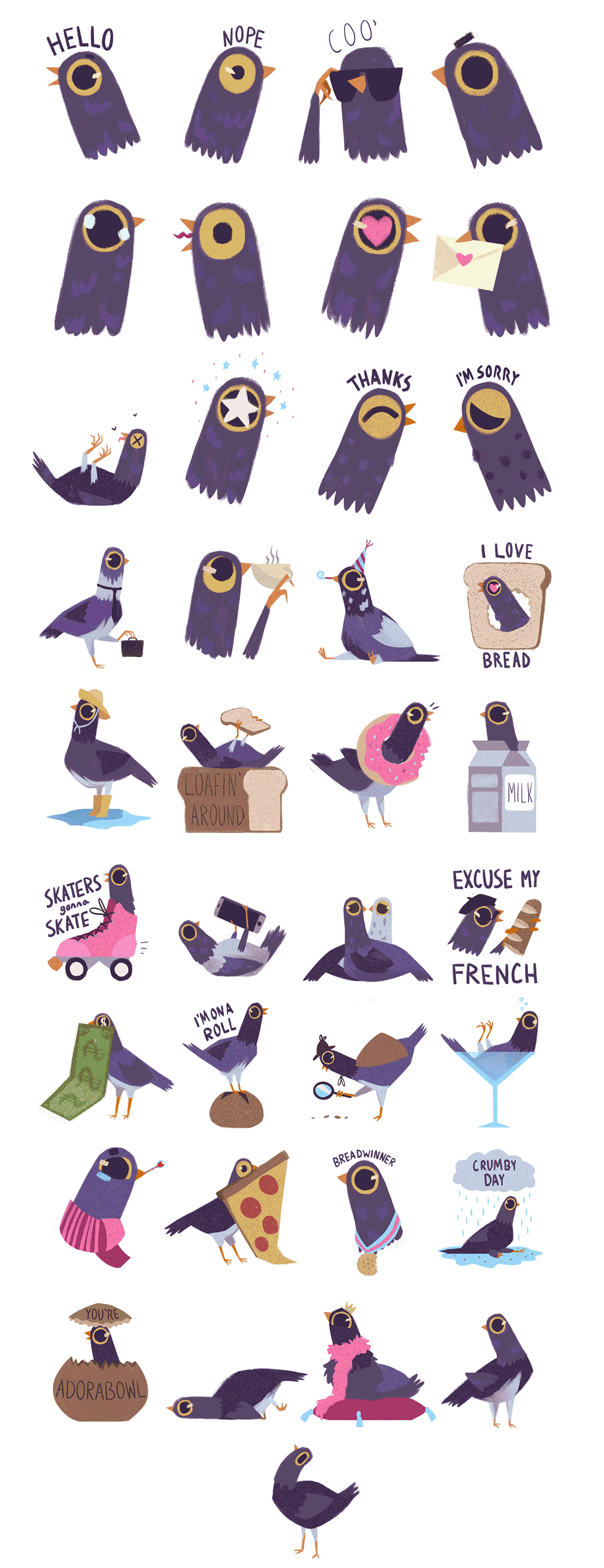
#4: Quan Inc Stickers


Quan Inc is a really useful example to have looked into, they have a host of 11 different sticker packs released already with thousands of downloads. I decided to analyse and contrast a few of their sticker packs to see any similarities between their sticker packs, to find out what works well with them and what doesn’t so when it comes to designing my stickers I’ll have a basis on what to do and what not to do.

I learnt a lot from their practices, they mainly utilised two strategies being a cute style and a weird style an example of this would be Business fish falling within the “weird” strategy and Yuttari dragon falling within the “cute” style. Potentially deciding on a strategy when designing my stickers could help improve their effectiveness.


#5: Social Media Stickers Survey


I produced a survey asking questions related to social media stickers, finding out what people prefer to use on social media (Stickers, Emojis, GIFs), how they use stickers in conversation, such as using them as reactions or greetings as well as finding out if they have downloaded a sticker pack from a movie or TV show they like. This information has been really valuable since I’m able to draw conclusions from the results and include them within my designs.
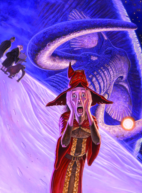

#6: Adi Draws


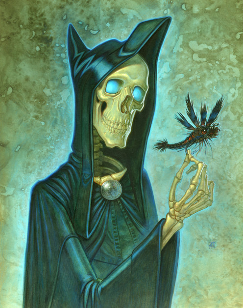
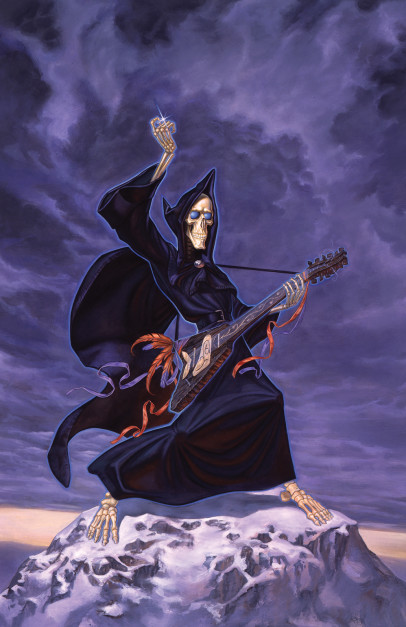
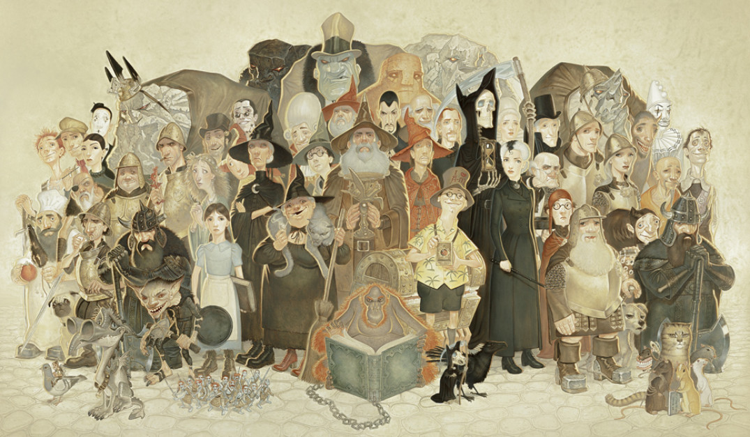
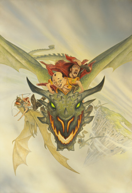
Looking at Adi Draws’ work has been really insightful, seeing his simple yet detailed illustrations has been inspiring and it’s a potential style I could use when designing my stickers, more importantly being able to see some of Adi’s interpretations for Terry Pratchett’s Discworld characters has been really insightful since he’s covering the same topic as I am for my major project.


#7: Thing Explainer: Complicated Stuff in Simple Words


I decided to take a look into Thing Explainer as it’s a good source of infographics, which is an area of graphic design that uses communication in a very specific way so I wanted to analyse them. Thing Explainer is a comedy book that attempts to explain complicated processes using simplistic terms. Looking into infographics helped give me an understanding of how I can use design to communicate.


#8: British Animation Awards 2018


I was fortunate enough to attend the 2018 British Animation Awards and was shown Programme 2. I wanted to go primarily to see different styles of animation and I wasn’t disappointed since we witnessed a host of different animation styles over the films we saw. It’s given me a better of idea of how to animate my stickers.
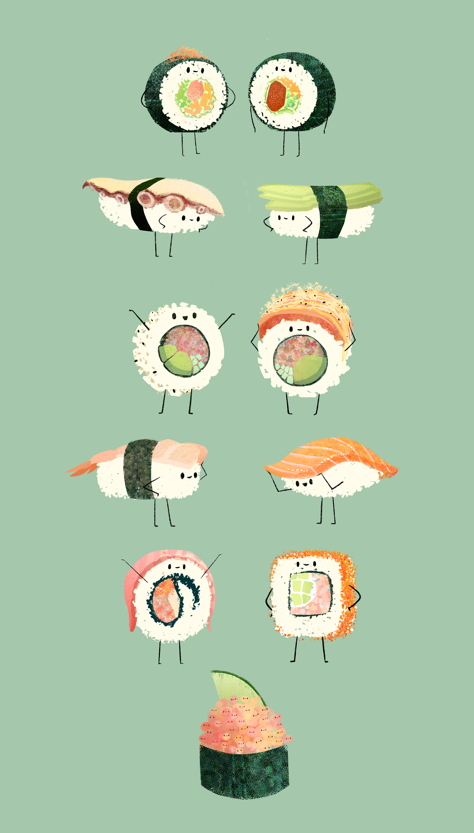

#9: Branded Stickers


I decided to take a look into some examples of branded stickers to see what other companies had done. They seemed to mostly be playing things on the safe side and seemed to mainly be references to the media they are representing. It’s been useful looking into them as it’s given me some potential ideas for designing my own social media stickers.


#10: Nautical Flags


Similarly to the reason why I looked into traffic signs, I wanted to look into Nautical flags as an example of communication in design. Unlike traffic signs which can be specific to countries and not necessarily international, due to the nature of Nautical flags they are international and can be understood by anyway with a conversion chart, regardless of the actual language they speak. Understanding that can potentially lead to a more wide appeal with my stickers.


Character Designs: The Luggage


Written Description


Sir Terry Pratchett’s description of The Luggage found in his published works is interesting, instead of giving a physical description of The Luggage like he’s done with some of the other characters discussed before hand, Pratchett’s describes The Luggage through the view point of other characters.

“The massive wooden chest, which he had last seen resting solidly on the quayside, was following on its master’s heels with a gentle rocking gait… Hugh bent slightly so he could see under the chest. There were lots and lots of little legs” Terry Pratchett, P16. The Colour of Magic (1983).

“Rincewind turned in his saddle and glanced at Twoflower’s Luggage, which was currently ambling along on its little legs, occasionally snapping its lid at butterflies…” Terry Pratchett, P82. The Colour of Magic (1983).

“Hrun had already pushed Twoflower away and was reaching for the Luggage…
…which sprouted legs, backed away, and raised its lid threateningly. In the uncertain light Rincewind thought he could see rows of enormous teeth, white as bleached beech.” Terry Pratchett, P107. The Colour of Magic (1983).

Based on the three excerpts above from The Colour of Magic (1983) I can gather that The Luggage is a large chest with lots and lots of little legs and rows of enormous teeth.


Paul Kidby


“Unseen Academicals” – Paul Kidby (2009)

'Rincewind in the Dungeon Dimensions' - 1995

“Rincewind in the Dungeon Dimension” Paul Kidby (1995)

Once again I opted to look at Paul Kidby’s work and specifically in this case, looking closely at his depiction of the Luggage. Kidby has opted for a conventional chest shape featuring either Brass or Gold metal trimmings around the chest.


Terry Pratchett’s The Colour of Magic (TV Movie)


One place that I wanted to look at for inspiration for The Luggage’s design was the TV movie directed by Vadim Jean. Mainly for how abstract the concept for the Luggage is, so I wanted to see how a live action rendition of a film would portray the Luggage since it would be a good example of the techniques that could be used in the fictional film the sticker set is accompanying.

Image result for the colour of magic tv movie the luggage

The chest used in the TV adaptation of The Colour of Magic follows a similar design to that of Paul Kidby’s paintings. The chest has a gold or brass trimming and has lots of legs (unfortunately not pictured above).


Josh Kirby


Related image

“The Colour of Magic” Josh Kirby (1983)

Josh Kirby painted the cover art for The Colour of Magic (1983), the painting depicts a scene in a tavern that prominently features The Luggage causing havoc for the tavern goers. This is a nice piece of artwork that clearly depicts Josh Kirby’s visualisation of Pratchett‘s The Luggage. I’m starting to see a trend here with the gold/brass metal trimmings, conventional chest design and hundreds of lags.


The Luggage – Discworld Official Figurine


30926737_554030871637230_1379209292_o


The next source of inspiration that I looked at would be the Official Discworld Figurine made by the Discworld Emporium. From looking at the design of the figurine, it seems that it was sculpted and painted based on Paul Kidby‘s paintings and illustrations. I really like the design of the figurine.


In summary, what I should include in the character design of The Luggage should include are the following:

  • Generic chest shape
  • Brass/Gold trimmings
  • Lots of legs
  • Big teeth

Kidby, P. (2009). Unseen Academicals. [Acrylic on Board] Unseen Academicals.

Kidby, P. (1995). Rincewind in the Dungeon Dimensions. [Oil on board The Pratchett Portfolio.

Terry Pratchett’s The Colour of Magic. (2008). [film] Directed by V. Jean. United Kingdom: Sky 1.

Kirby, J. (1983). The Colour of Magic. [Book Cover] The Colour of Magic.


Character Designs: Death


Written Description


Sir Terry Pratchett’s written descriptions of the characters that appear in his works is a key source of inspiration for designing the appearance of characters. It’s what allows the author to illustrate the characters within the reader’s imaginations and what a lot of other depictions is based on. Below is the written account on the description of Death in Terry Pratchett’s Discworld series.

“Death clicks across the black and white tiled floor on toes of bone, muttering inside his cowl as his skeletal fingers count along the rows of busy hourglasses.” Terry Pratchett, P1. Mort (1987).

“The rider strode towards him, black cloak billowing and feet making little clicking sounds on the cobbles” Terry Pratchett, P10. Mort (1987).

“He rushed forward to help the fallen figure and found himself grabbing hold of a hand that was nothing more than polished bone, smooth and rather yellowed like an old billiard ball. The figure’s hood fell back, and a naked skull turned its empty eyesockets towards him. Not quite empty though. Deep within them, as though they were windows looking across the gulfs of space, were two tiny blue stars.” Terry Pratchett, P11. Mort (1987).

Unlike some other character’s Death’s description in Mort (1987) is more detailed and does a good job of describing the characters appearance, sporting black cloaks, a skeletal depiction and two tiny blue stars for eyes.


Paul Kidby


Similar to when looking for depictions of other characters, I turn to the works of Paul Kidby due to his influence and works on the Discworld series. Below are a few examples of Kidby’s work depicting the Terry Pratchett’s character of Death.

'Death's Glory' - 2014

“Death’s Glory” Paul Kidby (2014)

'Under an Eldritch Sky' - 1999

“Under an Eldritch Sky” Paul Kidby (1999)

'Check Mort' - 2011

“Check Mort” Paul Kidby (2011)

'Death with Kitten II' - 2011

“Death with Kitten II” Paul Kidby (2011)

Kidby’s depiction of death follows the description provided by Terry Pratchett. Death features two blue eyes, a ‘yellow in colour’ skeleton, donning black robes and interestingly the inclusion of a cloak pin depicting the Greek letter “Omega”. Kidby illustrates Death in quite a realistic way and this adds to the charm of his illustrations.


Terry Pratchett’s The Colour of Magic (TV Movie)


Death is portrayed in the TV adaptation of The Colour of Magic using practical effects and was voiced by the late Christopher Lee. Below is an image depicting Death in the TV Movie.

death

The portrayal of Death in the TV film is similar to the description that Terry Pratchett provided, featuring black robes, blue eyes, an omega cloack broach and well being a skeleton. Seeing this rendition of Death helped to visualise what Death might look like in the fictional theatrical release that the sticker set is advertising.


The Discworld Collector’s Library


Similar to The Colour of Magic, Terry Pratchett’s Mort also was re-released in a hard back edition in The Discworld Collector’s Library. The front cover was designed by Us Now and illustrated by Joe McLaren. The front cover depicts Death riding his horse. The depiction of Death here is very minimal, choosing to only show black clothes and highlighting his skull, it’s good to see that even a basic interpretation can still communicate.


Death’s Cloak Pin – Discworld Emporium


Below is a photograph of a replica of Death‘s cloak pin made and sold by the Discworld Emporium. It’s an oval in design, featuring the Greek letter Omega in the centre of the pin.

cloak


In summary, what my depiction should include are the following:

  • Black robes
  • Yellowed bone
  • Skeleton
  • Blue stars for eyes
  • Omega cloak pin

Pratchett, T., 1987. Mort. 1st ed. Great Britain: Colin Smythe.

Kidby, P. (2014). Death’s Glory. [Acrylic on Board] Private Commision.

Kidby, P. (1999). Under an Eldritch Sky. [Oil on Board] The Art of Discworld.

Kidby, P. (2011). Check Mort. [Acrylic on Board].

Kidby, P. (2011). Death with Kitten II. [Acrylic on Illustration Board].

Terry Pratchett’s The Colour of Magic. (2008). [film] Directed by V. Jean. United Kingdom: Sky 1.

McLaren, J. (2014). Mort. [Book Cover]. Mort, The Discworld Collector’s Library


Character Designs: Twoflower


Written Description


When it comes to designing Twoflower in the sticker pack, I need to know his appearance. For this, looking at variety of sources to understand the visual elements (physical descriptions, articles of clothing..etc) that have led to the common appearance of Twoflower. The first place I looked, is that of Terry Pratchett’s own description of Twoflower, underneath is a segment taken from The Colour of Magic that discusses Twoflower’s appearance.

“It was small and skinny, and dressed very oddly in a pair of knee length britches and a shirt in such a violent and vivid conflict of colours that Weasel’s fastidious eye was offended even in the half-light.” Terry Pratchett, P12. The Colour of Magic (1983).

“The four-eyed man looked at his book” Terry Pratchett, P15. The Colour of Magic (1983).

Sir Terry Pratchett’s description of Twoflower gives off the impression of someone wearing glasses a colourful dress and the stature of a small man. The description within the book isn’t enough to get the design from, so I’ll need to look to other sources for his appearance. Fortunately there has been a lots of depictions of Twoflower from a variety of sources, from artist Paul Kidby to a live action TV depiction of the character.


Paul Kidby


Below are paintings of Twoflower painted by the artist Paul Kidby who was a friend of Terry Pratchett and has done a lot of the book covers for the series. Looking to his paintings of the character is a good cue for visual representation for Twoflower’s character.

'Discworld Massif' - 2014

Discworld MassifPaul Kidby (2014)

'Colour of Magic' (Rincewind and Twoflower on dragon) - 2010

“Colour of Magic (Rincewind and Twoflower on Dragon)” Paul Kidby (2012)

Kidby depicts Twoflower of that of a typical tourist, he seems Asian in appearance, sporting round glasses, a Hawaiian styled shirt and round glasses. Kidby’s depiction of Twoflower has him wearing a hat stating “I ❤ AM” in reference to “I ❤ NY” since Twoflower is depicted in the story as being a stereotypical tourist.


Josh Kirby


Related image

“The Light Fantastic” Josh Kirby (1986)

Josh Kirby produced the cover art for the first publications of a lot of the Discworld series, he was also one of the first artists to depict Discworld characters in an official manner. Below is the artwork used for the cover of the sequel to The Colour of Magic (1983), The Light Fantastic (1986).  The depiction of Twoflower in this artwork shows him wearing bizzare clothing and having a literal interpretation of four eyes. Sir Terry Pratchett later specified that the line referenced earlier “The four-eyed man looked at his book” was in reference to Twoflower wearing glasses and not actually having four eyes.


Terry Pratchett’s The Colour of Magic (TV Movie)


Twoflower is portrayed in Terry Pratchett’s The Colour of Magic by actor Sean Astin. An image of his depiction in the TV movie can be found below.

Twoflower

Sean Astin’s portrayal of Twoflower highlights a lot of similar quirks from Paul Kidby’s depiction of the character, he’s wearing a stereotypical “Hawaiian shirt” a tourist bucket hat, round glasses and shorts. Where as Kidby’s portrayal of the character is asian, the portrayal of Twoflower in the TV film is that of Caucasian.


The Discworld Collector’s Library


Image result for the colour of magic discworld collectors edition

A commemorative hardback edition of The Colour of Magic was released in 2014, part of a series called The Discworld Collector’s Library. The cover features artwork by Joe McLaren that depicts Twoflower, Rincewind and the Luggage. McLaren’s depiction of Twoflower shows round glasses, a floral Hawaiian shirt and short hair. I like the simplistic depiction of Twoflower in McLaren’s work.


In summary, what my depiction should include are the following:

  • Big round glasses
  • Brown hair
  • Hawaaiin shirt
  • Short
  • Bucket hat

Pratchett, T., 1983. The Colour of Magic. 1st ed. Great Britain: Colin Smythe.

Terry Pratchett’s The Colour of Magic. (2008). [film] Directed by V. Jean. United Kingdom: Sky 1.

McLaren, J. (2014). The Colour of Magic. [Book Cover]. The Colour of Magic, The Discworld Collector’s Library

Kirby, J. (1986). The Light Fantastic. [Book Cover] The Light Fantastic.

Kidby, P. (2002). Discworld Massif. [Acrylic on Canvas] The Last Hero.

Kidby, P. (2012). Colour of Magic (Rincewind and Twoflower on Dragon) 2010 [Acrylic on illustration board] The Pratchett Portfolio.


Character Designs: Rincewind


Written Description


When designing the appearance of Rincewind, I need to know his appearance. To this I looked to a variety of sources to gain an understanding of the visual elements that have led to the appearance of Rincewind the character. Below is a segment taken from The Colour of Magic that discusses Rincewind’s appearance.

“Scrawny, like most wizards, and clad in a dark red robe on which a few mystic sigils were embroidered in tarnished sequins. Some might have taken him for a mere apprentice enchanter who had run away from his master out of defiance, boredom, fear and a lingering taste for heterosexuality. Yet around his neck was a chain bearing the bronze octagon that marked him as an alumnus of Unseen University”. Terry Pratchett, P22. The Colour of Magic (1983).

There’s a certain ambiguity to Rincewind’s description and this is reflected in other sources of his description. There has been a host of depictions of Rincewind from a variety of sources, from artist Paul Kidby, Royal Mail stamps, to even a live action TV adaptation of the book.


Paul Kidby


Below are some paintings of Rincewind done by the artist Paul Kidby who was a friend of Terry Pratchett and has done the majority of the book covers for the series. Looking to his illustrations of the character is a good cue for visual representation, since the artist has lots of experience of painting the character, as well as had experience working for the author.

'The Rincewind Scream' - 2002

“The Rincewind Scream” Paul Kidby (2002)

'Rincewind in the Dungeon Dimensions' - 1995

“Rincewind in the Dungeon Dimension” Paul Kidby (1995)

'Colour of Magic' (Rincewind and Twoflower on dragon) - 2010

“Colour of Magic (Rincewind and Twoflower on Dragon)” Paul Kidby (2012)

Kidby’s depicts Rincewind as an adult with brown hair, a scraggy short beard that is wearing ragged red wizarding robes, covered in sequins, a hat covered in sewn on stars and the incorrectly spelled word “wizzard”. It’s interesting to keep in mind.


Terry Pratchett’s The Colour of Magic (TV Movie)


Rincewind is portrayed in Terry Pratchett’s The Colour of Magic by actor Sir David John White (commonly known by his stage name David Jason). An image of his depiction in the TV movie can be found below.

rinceiwnd

Sir David John White’s depiction of Rincewind follows many of the same visual keys outlined by Paul Kidby’s work, such as ragged clothing, sequins crudely sewn on and wearing red clothing. This depiction of Rincewind is interesting due to his apparent age. In The Colour of Magic (1983) Rincewind’s age is never stated so approaching Rincewind’s character from this angle was certainly an outlier.


Royal Mail Stamp


In 2011, the Royal Mail issued a set of commemorative stamps entitled “Stamps from Magical Realms” that featured prominent wizards and witches from popular/influential British literature. The set included Rincewind from Terry Pratchett’s Discworld series among other prominent wizards such as Merlin from Arthurian legends.

Below you can find the depiction of Rincewind.

Magical-Realms-stamps-006

The style used is interesting and his appearance somewhat differs from other interpretations of Rincewind. Such as the depiction of well maintained clothing other features stay the same such as the inclusion of “Wizzard” and red wizarding robes.


Micro Art Studio Miniatures


A polish art studio by the name of Micro Art Studios produced a set of 30mm miniatures based on characters from Terry Pratchett’s Discworld series. The sculptures are based off Paul Kidby’s paintings.

30849496_551072171933100_1554162804_o

Above is my attempt at painting the miniature with the colour scheme depicted in Paul Kidby’s work. For reference, below, there is a professionally painted version from Micro Art Studios.

Rincemini

The miniature sculptures show the basic scraggy appearance, a small rugged beard, tattered clothing and the iconic “Wizzard”.


In summary, what my depiction should include are the following:

  • Red Tattered robes
  • Brown hair
  • Short beard/facial hair
  • Ambiguous age
  • Wizzard
  • Sequins (Stars, Moons)

Pratchett, T., 1983. The Colour of Magic. 1st ed. Great Britain: Colin Smythe.

Kidby, P. (2002). The Rincewind Scream. [Oil on board] The Last Hero.

Kidby, P. (1995). Rincewind in the Dungeon Dimensions. [Oil on board The Pratchett Portfolio.

Kidby, P. (2012). Colour of Magic (Rincewind and Twoflower on Dragon) 2010 [Acrylic on illustration board] The Pratchett Portfolio.

Terry Pratchett’s The Colour of Magic. (2008). [film] Directed by V. Jean. United Kingdom: Sky 1.

Royal Mail. (2011). Rincewind Terry Pratchett’s Discworld [Stamp]. Magical Realm 1st Class Stamps

The Guardian. (2011). Gallery: Royal Mail: Stamps from magical realms. [online] Available at: https://www.theguardian.com/childrens-books-site/gallery/2011/mar/09/royal-mail-stamps-magical-realms [Accessed 6 Feb. 2018].

Micro Art Studios. Rincewind. Sculpture. 


Representation in Ideographs


Under representation in Emojis


are-emojis-harmful-to-girls-compressed


For this major project, I wanted to look into the effects that design has on communication. One such area that graphic design has impacted communication would be the implementation and use of ’emojis’. Since their inception, they were intended to be used as ideographs to represent ideas/concepts such as emotions, but the cultural impact Emojis have had has been much wider than you would think, and as a result questions of representation within emojis has been raised.

In 2016 the company Always launched a new part of their #LikeAGirl Campaign that tackled the issue of representation in emojis. The campaign argued that most of the Emojis that were commonplace feature lots of male representation, with little to no female representation. The reason for why this was an important issue that needs to be changed is down to the affects that they have on self esteem.

Always sponsored a national survey on the topic, reaching around 1000 women, Fitfy-four percent of the recipients aged between 16 to 24 years, think that female emojis are stereotypical, with just about half saying that emojis represent a limited range of female interests.

This is an area that I would have overlooked without paying too much attention to it. Granted, this a hot button issue with two sides to the story. It’s important to be aware of affects that graphic design can have so you can accommodate for it.


Wallace, K. (2016). Are female emojis sexist and harmful to girls?.
CNN. [online] Available at: https://edition.cnn.com/2016/03/02/health/female-emojis-stereotypes-likeagirl/index.html [Accessed 15 Dec. 2017].

Procter & Gamble (2016). Are Emojis Limiting Girls? New Always® #LikeAGirl Video Takes a Closer Look at How Girls’ Favorite Language Limits Them to Stereotypes; Encourages Girls to Rally for Change. [online] Businesswire.com. Available at: https://www.businesswire.com/news/home/20160302005393/en/Emojis-Limiting-Girls-Always%C2%AE-LikeAGirl-Video-Takes [Accessed 15 Dec. 2017].


Branded Stickers


SCG Power Rangers


Power-Rangers


This sticker pack was designed to promote the children’s television series Power Rangers  released by Saban Brands. The sticker pack contains twenty non animated stickers featuring different characters, good guys and bad guys within the sticker pack. The pack contains eight stickers featuring text where as the rest rely on body language and some basic codes to convey meaning. I.e. a thought bubble with rain in it to convey being upset/down in the dumps. The stickers are all of a consistent style and seem to play it safe, using basic body language in most of their designs to convey meaning.


Rick and Morty


Rick-and-Morty


This sticker pack is based off the TV Rick and Morty and features 16 non animated stickers based on several of the characters from the TV show. Unlike the Power Rangers sticker pack I looked at before hand, the style used for this pack is the same as the style used within the TV show. The majority of the sticker pack uses text alongside an illustration to convey meaning where as the ones that don’t rely on facial expressions to convey meaning.


Saban Brands, (2014), Power Rangers Stickers [ONLINE]. Available at: https://facebookstickers.info/power-rangers/ [Accessed 28 November 2017].

Adult Swim, (2017), Rick and Morty Stickers [ONLINE]. Available at: https://facebookstickers.info/rick-and-morty/ [Accessed 28 November 2017].

Syd Weiler


Trash Doves


Syd Weiler is an American Animator and Illustrator based in West Virginia, in 2016 she created the Trash Doves Sticker Pack for iOS that was later licensed by Facebook. The sticker set features 37 animated and non animated stickers based around a purple dove doing various activities and showing a variety of emotions.

“Trash Doves Sticker Pack” Syd Weiler (2016)

When the sticker set was added to Facebook in late 2016, the sticker set had an unintended side affect, with a certain sticker of the dove “head banging” became spammed as a result of an internet joke. Most comment sections were spammed with the sticker and from my own experience it was spammed in group chats, getting in the way of conversation.

Seeing the affect a sticker pack has had on the social media site made me question if there has been any other effects on conversations due to stickers. Though, spamming the website for a week before the joke became old was only a part of the bizarre case of this sticker pack.

Due to the release date of the sticker set, it was coming up to the 2016 Presidential elections in the United States of America, and it seemed that everything was becoming politicise including the trash doves sticker set. The sticker set was accused of being used as a symbol for the ‘Alt-Right’

The trash doves sticker set is a good example of how Graphic Design has an affect on communication, and communication can have an affect on the Design. This is an example of where the sticker set impeded and even stopped communication and where the meaning of the Designs had changed through word of mouth. Understanding the impact this has can lead to answering the question of my study.


Sushi Friends


Wanting to find out more about the sticker set, I found Syd’s portfolio and discovered other examples of her work. Such as the illustrations referenced below. I really liked the use of texture in her digital illustrations. It adds a new dimension to how an image is represented digitally.

In an age where digital art is becoming more and more common, I’m finding crisp and clean visual representations are becoming over used. Something that was lost when doing digital art work, such as texture being re added with special brushes and adding settings I’ve found works really well and is something to consider for my own sticker pack.

“Sushi Friends” Syd Weiler (2016)


Weiler, S. (n.d.). Trash Doves Sticker Pack. [online] sydweiler. Available at: http://sydweiler.com/trash-doves-ios10-sticker-pack [Accessed 25 Nov. 2017]

Cresci, E. (2017). Trash dove: how a purple bird took over Facebook. The Guardian. [online] Available at: https://www.theguardian.com/technology/shortcuts/2017/feb/15/trash-dove-how-a-purple-bird-took-over-facebook [Accessed 25 Nov. 2017].

Weiler, S. (n.d.). Sushi Friends. [online] sydweiler. Available at: http://sydweiler.com/sushi-friends-drawing-brush-set [Accessed 25 Nov. 2017]

Frey, Q. (2017). Right Wing Dove Squad: How Trash Doves Became The Symbol of The Alt Right. [online] Medium. Available at: https://medium.com/@Freequincy/right-wing-dove-squad-how-trash-dove-became-the-symbol-of-the-alt-right-c7794b84a48d [Accessed 25 Nov. 2017].


Quan Inc. Stickers


Quan Inc.


Quan Inc. Is a Japanese web development company that specialises in creating characters, designing stickers for messaging services such as Facebook Messenger and Kik messenger. Quan Inc has been making stickers for the past couple of years and have a list of eleven different sticker packs to choose from within the Facebook sticker store. Below are some samples of the different sticker packs.

The stickers range over a host of different artistic styles, some being cute and others being quite obscure with their art styles. I’m going to look into two of their sticker packs to analyse design choices and to get ideas for my own stickers.


Yuttari Dragon


Yuttari-Dragon


Above is the complete selection of the stickers provided in Quan Inc’s Yuttari Dragon sticker pack. All of the stimages above are static images and non animated. Four of the stickers display text of some variety such as as the signs saying ‘yes’ and ‘no’. The rest of the stickers seem to show different emotions and feelings such as crying, sleeping, love, happiness, excitement..etc. The stickers are cute in appearance due to the simplistic shapes such as basic circles and curves.

Screen Shot 2018-02-13 at 1.02.48 PM

The colours used also contribute to the appearance of the stickers since most of the  stickers are coloured with pastel colours. Since Quan Inc is a Japanese company there are may codes and signifiers here that do not work with a western audience, such as the hash tag symbol on the side of the dragons face in the sticker to the left of this paragraph indicates ‘anger’ yet this would not work with a western audience as that is a Japanese code.

There are some more obvious examples of this featured in this sticker pack such as use of the Japanese language within the stickers, language is something that I should consider if I decide to use text within my stickers, should I make multiple packs for different languages? Or should I take a similar approach to Quan Inc and just use the one language.

Screen Shot 2018-02-13 at 1.11.09 PM

The stickers make use of simple pastel colours and most of them are very colourful making them attractive to look at and subsequently be used in a text conversation. The illustrations use thick outlines and all have a general ‘hand drawn’ aesthetic to them. All of these contribute to give a cute appearance and work quite well for the medium that they’re designed for.


Business Fish


Business-Fish


Where as Yuttari Dragon‘s main appeal is it’s cute simplistic style, Business Fish‘s appeal is completely different. Business Fish is quite absurd in it’s premise and execution. The sticker pack was designed around a character whose a business man with a fish head. The sticker pack features six stickers that use text where as the rest of them play with facial expressions and body language in order to convey meaning.

Since the style is slightly absurd and isn’t going for the cute aesthetic that the other sticker pack went for, Business Fish mainly uses muted realistic colours and thin outlines in its execution.

Unlike the Yuttari Dragon sticker pack, this pack seems to be more friendly with it’s codes and signifiers with only a few showing the cultural origination of the stickers. For example the two depicted below this paragraph show cultural norms that can be found in Japan, such as wearing a face mask to depict being sick and bowing. In Japan bowing is a lot more frequent than in the United Kingdom so knowing the context of where these stickers originated from it makes sense as to why it’s included within this sticker pack.


Yuichiro Ohno, (2015), Business Fish [ONLINE]. Available at: https://businessfish.jimdo.com/ %5BAccessed 20 November 2017].

Quan Inc, (2015), Yuttari Dragon [ONLINE]. Available at: http://quan-inc.jp/en/ [Accessed 20 November 2017].

Quan Inc, (2015), Masked Wrestler Q [ONLINE]. Available at: http://quan-inc.jp/en/ [Accessed 20 November 2017].

Quan Inc, (2015), Meow Town [ONLINE]. Available at: http://quan-inc.jp/en/ [Accessed 20 November 2017].

Quan Inc, (2015), Ninja Bear [ONLINE]. Available at: http://quan-inc.jp/en/ [Accessed 20 November 2017].

Quan Inc, (2015), Nyanchi [ONLINE]. Available at: http://quan-inc.jp/en/ [Accessed 20 November 2017].

Quan Inc, (2015), Piyomaru [ONLINE]. Available at: http://quan-inc.jp/en/ [Accessed 20 November 2017].

Quan Inc, (2015), Sugar Cubs [ONLINE]. Available at: http://quan-inc.jp/en/ [Accessed 20 November 2017].

Quan Inc, (2015), Yarukizero [ONLINE]. Available at: http://quan-inc.jp/en/ [Accessed 20 November 2017].

Quan Inc, (2015), Bettakuma [ONLINE]. Available at: http://quan-inc.jp/en/ [Accessed 20 November 2017].

Quan Inc, (2015), Fantastic Sumo [ONLINE]. Available at: http://quan-inc.jp/en/ [Accessed 20 November 2017].


Traffic Signs


Traffic Signs


Looking into the relationship between communication and design is a crucial focus for my study, so looking into already existing examples is important for getting an idea of how the two concepts are inter linked. Designs can be used in lots of different contexts in order to communicate, from subliminal designs advertising a product to more impactful designs delivering instructions.

A good example of designs that communicate instructions are traffic signs. They need to be simple enough to understand yet impactful enough to be understood and followed. They need to be recognisable from a distance and distinct enough to not be confused with another sign, all of these factors have restricted the types of designs and the colours that can be used in the designs of traffic signs.

As a result, most of traffic signs used by The Highway Code make use of simple colours, numbers and basic shapes to convey meaning. For example signs that utilise red circles are usually prohibitive with their message and triangular signs are warning signs. By using simplistic icons depicting different types of transport and road i.e. bicylces and bridges, a minimal use of colours that have semiotic meanings i.e. red equals danger/stop red equals good/go, they have been quite effective with their designs.


This slideshow requires JavaScript.


Driver and Vehicle Standards Agency (DVSA), Great Britain: Department for Transport, 2015. The Highway Code. London, United Kingdom: TSO.